
Топ иконок geometry dash
Обновлено: 08.07.2024
All credit goes to Ze Memerr who inspired me to make this post.
Anyways, I usually don't write my lists in any particular order, but since this is a list talking about my personal 10 best icons in Geometry Dash, I have to. Anyways, let's get started.

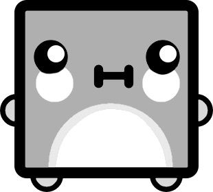
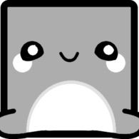
Although this icon can be easily obtained by buying it from the shop for 1,000 mana orbs, I still kind of like it. Unlike the other gradient icon that you can buy in the shop, this one looks like it had some effort out into it. It must have been hard for Robtop to add in the curved smile and the shadows under the eyes. I can see why people wouldn't like this icon since it is one of the many "cartoonish" icons in 2.1, but I personally like it.
You need 60 user coins for this icon. This icon is a great trophy for players who reach the 60 user coins milestone. This was one of Robtop's first attempts at putting a tongue on an icon, and I personally think that he did a great job. I also like the shading inside the mouth. I don't
know why, but salmon is a great color to apply to this icon.
These 2 icons were not intended to both be unlocked by 60 coins. Anyways, this icon is a rather unique icon for its time. I like how the center of the cube connects to the other parts of the cube. This gives a more complicated design to the icon, which makes the icon look effortful. I can also imagine the triangular parts of the icon to be difficult to edit for Robtop. Just like how I said salmon goes well with the 60 user coins icon, I think that orange goes well with this icon. It's probably because of the electrodynamix sneak peek.
I can see a lot of people hating this icon since it's similar to the 60 user coins icon, however I like this icon. The design is definitely more complicated and intricate than the 60 user coins icon. The icon has circular eyes, ears, and a small curve above its mouth. This icon is obviously more complex than most Geometry Dash icons with its circular and triangular shapes. Light cyan seems to be the best color for this icon. It's a shame that this is a World exclusive that is unlocked by beating Frontlines.
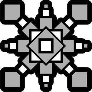
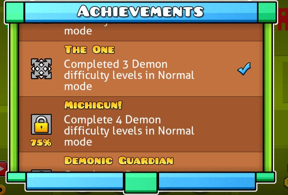
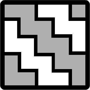
I know a lot of people like this icon, but there's a good reason for it. This icon that you get for completing 4 demons is extremely complex in design. This icon was added rather early on in Geometry Dash's development and it looks amazing. It seems that even back then RobTop was able to make extremely complicated icons. This one also comes at a cheap price.
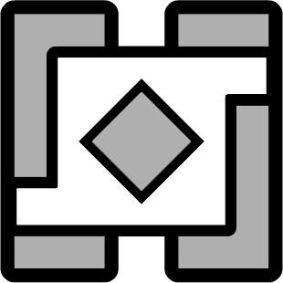
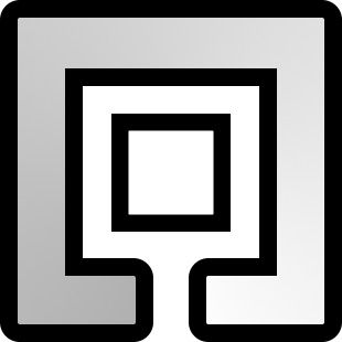
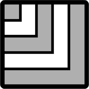
You can get this icon from 30 demons. That was quite an accomplishment at the time, and your reward was a unique icon. Although it doesn't look like it took as much effort as the 4 demons icon, it definitely looks more creative. Robtop decided to make a square with long ends as the main focus of the icon. He then spiced the icon up by adding rectangles along the edges and a diamond in the middle. Although it doesn't look like effort was put into this icon, creativity was definitely put into it. That diamond also probably required precise pixel placing.

You need 95 secret coins for this icons, which is perfectly reasonable. This icon is one of the most futuristic looking icons on Geometry Dash. It looks like something straight out of an Etzer texture pack where most of the icons look futuristic. Although it probably didn't take too much thought, the circle in the middle looks really good. The only challenge in making the circle that I can think of is the shape. I doubt that Robtop has any special shape tools when he makes these icons.
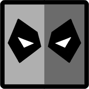
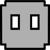
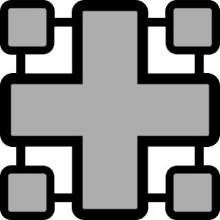
This icon that you get for 110 secret coins is so simple, yet so amazing. Half of the icon is your primary, and half is your secondary color. How could an unoriginal idea be so well executed? The icon also has complicated eyes with black
borders. This is probably one of the best super hero references in 2.0.
Ultimate Deadlocked ( Collect All 3 Coins In Deadlocked )

Ultimate Seven Seas ( Collect 3 Coins In The Seven Seas )
Steamrolling! ( Complete Stereo Madness, Back On Track, and Polargeist on Steam. )

I would have added more honorable mentions, but obtaining pictures of icons is rather tedious.
For those of you who see my YouTube ( probably only 7 of you ), you'd know that I use this icon. There's a simple reason for that; it's probably my favorite icon in Geometry Dash. When I heard about this icon, I wanted this icon immediately. I even wanted the icon in World. Sadly, the icon costed 2,000 diamonds. Now that I think about it, 2,000 diamonds isn't a lot, but it definitely seemed that way a while ago. There's nothing too complicated or special about this icon, other than the fact that it looks like Kirby. I don't even play too many Kirby games and I still love this icon. I don't know why I live this icon, but I just do. I'll probably never change my icon like how GuitarHeroStyles never changes his. The same goes for my wave which I will talk about.
Geometry dash 2.2 уже не за горами и поэтому я решил сделать вторую часть о том что будет в новой версии. Но а будет мы говорить о иконках и текстурах. Сразу говорю что эта часть будет по короче ведь информации мало но думаю вам понравиться.
Иконка дискорда:Думаю вам знакома эта иконка из за дискорда. Не будем останавливается долго и поэтому скажу что мне кажется что чтоб её получить надо подписаться на сервер дискорда робтопа.

Иконка твича:Тоже вам знакома. Получить можно если подписаться на твич канал робтопа

Корабль из режима платформера:Она была в прошлой части поэтому не будем о ней говорить.

Вот тут интересней:Честно иконки не очень. Они мне не понравились и тем более робтоп взял некоторые из своей игры.

Так же корабль глаз. Отсылка на тераррию.

Ну и ещё корабли. Тоже клас но можно было и лучше
На иконках всё. Приступаем к текстурам

Тут есть все новые триггеры которые показывал в прошлой части. Но меня заинтересовал триггер "Stop jump" не знаю что он означает но думаю при его взаимодействии ты не сможешь прыгать но если поставить галочку на "Activate group" то ты сможешь прыгать.

Пиксельный блок:Заметьте что у него нет сглаживания. Ну а так прикольный блок.

Забыл вам сказать что эти текстуры используются в блоке эффекта о которых я не сказал подробнее ведь вы б читали это год.

Новые монстры:Их названия ещё не сказали но их можно увидеть в видео робтопа про режим платформера.

Кнопки из режима платформера:Тут всё понятно кроме кнопки с мечом. Думаю эта шутка от робтопа.

Новые эффекты:Очень много эффектов. Прикольные но вот вопрос. Что делать с текстурами огня которые были в 2.0? И с другими эффектами из 2.0. Что делать?

Новые гаунтленды:Не знаю где возьмёт Роб топ столько уровней.
Меня заинтересовал второй остров второго ряда и первый остров первого ряда: Они очень похожи на острова из Geometry dash world.
Ну а на этом всё. Я думаю информация была полезной. Часть три будет когда выйдет сник пик.
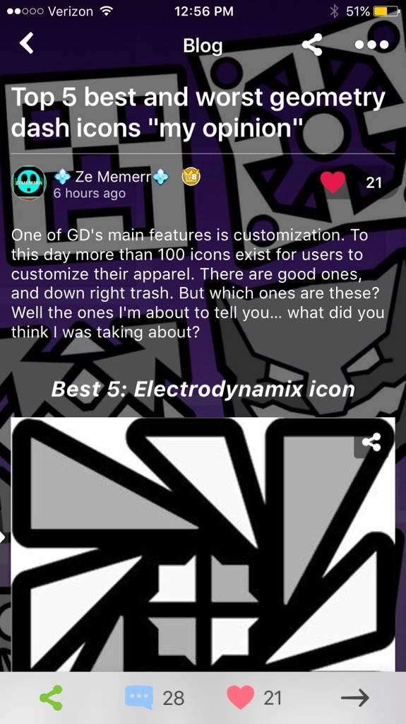
One of GD's main features is customization. To this day more than 100 icons exist for users to customize their apparel. There are good ones, and down right trash. But which ones are these? Well the ones I'm about to tell you… what did you think I was taking about?
Best 5: Electrodynamix icon
This is definitely my favorite icon you get from a main level. For its time, it's very creative and appealing to the eye. And even though It's a kind of copy and paste design, it's not some blocky or face icon, it's a somewhat spiky and awesome icon.
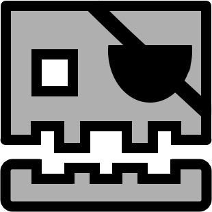
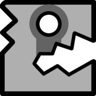
Worst 5: Gatekeeper's Query icon
While I adore the look of all gradients, this one has to be my least favorite. The gradient visuals look fantastic, but the sheer laziness of this icon is what makes me hate it. It's literally just the first icon in the game, with a hole at the bottom and now it's gradient, I could think of that in 1 minute.
Best 4: 4 demons icon
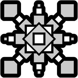
Of course this isn't just a 4 demon icon, it's the icon that The famous player Michigun, and his 2083 clones use "looking at you white Michigun" While the Electrodynamix icon was detailed for its time, This one literally looks 10x more lovely, and, it was made an update before. If I played back in 1.6 and beat 4 demons, this would definitely be the icon I would use. Also, I love this icon so much I did this.
Worst 4: Rub Rub icon

What's really sad is that this got its own update. It's literally the shy guy icon without eyes and with a slight cut in the middle. I think this is actually a downgrade from the shy guy icon, unlike the Gate keeper Queery icon, it's not gradient, it's just, ugly,
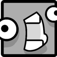
Best 3: 3000 stars icon

I absolutely LOVE Reference icons, and this one looks exactly like the source material. Super meat boy is one of my favorite games too, so having a slightly small game be referenced in a game like this is great! It looks very polished for a 2.0 icon, I used to think it was a 2.1 icon! Sadly I haven't obtained this treasure yet, I only have about 1050 stars.
Worst 3: 130 coins icon
Just imagine, one day, you finally achieved 130 coins, and your prize is, THIS GARBAGE. This is literally the spring icon but theirs a rectangle in the middle now, and their's only one famous GD Youtuber who used that icon, and that's Zobros, but he made it a gradient. So basically they recreated one of the worst icons in the game…
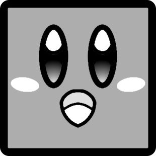
Best 2: Cod3breaker
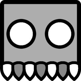
"The Rarest Pepe around is triggered" anyways, as you know, I call this the scrubbing bubbles icon, because, well, that's what it is pretty much, let's have a comparison.
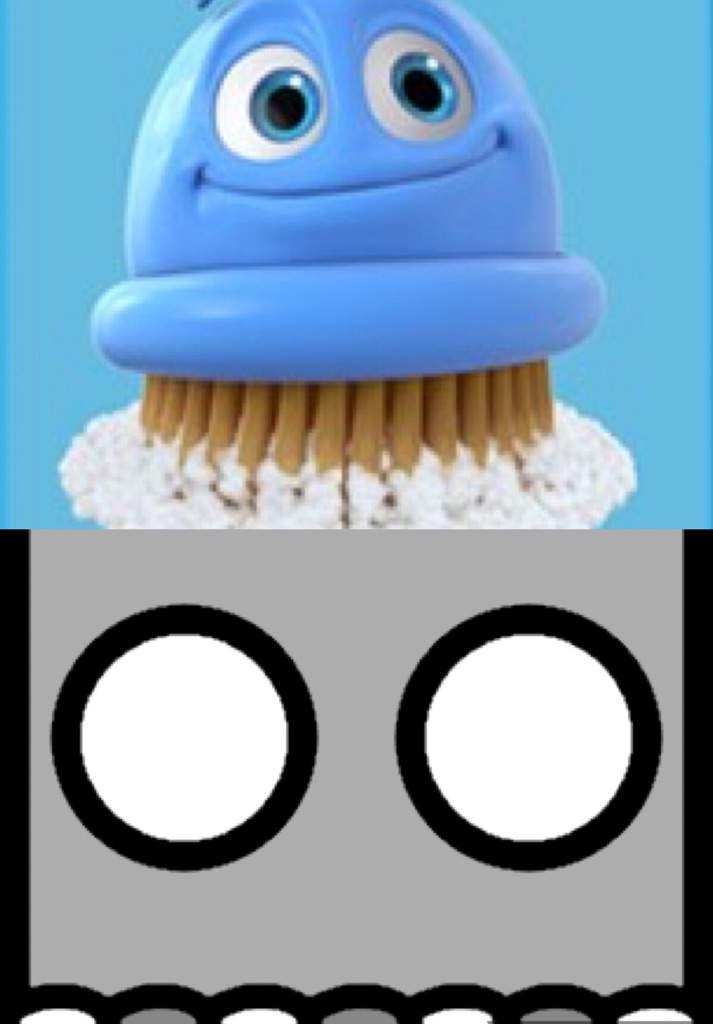
They both have bristles and a similar head shape, but the eyes are different and it has no face. Personally tho, A soulless scrubbing bubbles icon really appeals to me. I love this icon so much I gave it a smile on the Steam version of GD

It's also really satisfying when you finally pull off the Steps needed to get it, although after doing it, the steps seem really simple.
Worst 2: Catch them all!
The only good thing about this icon is the Pokémon reference, but other than that, it's garbage. First off, the design originates from the top right corner instead of the middle, Excuse me? Second off, this is just lines, no curves, no eyes, just straight lines. This is also pretty hard to unlock, you have to wait for it on the title screen than destroy it, it's Counterpart, the Mario world block, is 10000 times better than this garbage. Fun fact, there used to be a glitch where it was impossible to get this icon without touching a glitched Tiny icon in the menu, and honestly, it should of stayed that way.
Now time for some honerable mentions

AND some dishonorable mentions

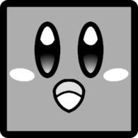
Best 1: Thief Thief! "Shyguy icon"
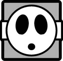
How can this not be number one? I literally use his icon as my profile picture, and used it in game since I got it. First using red and white, then Gray and white, then ultimately switching to my favorite color combination other than purple and light blue, Black and Light blue. Not only that, but shy guys are not that common of a reference, I would think they would make a reference to Mario or Yoshi, but instead, Robtop went outside of the box and implemented a lesser known Mario character. This shows me that Robtop payed attention to Mario in order to add icons, instead of adding a Mario one just to attract more fans. Once again, I love this icon so much, I just had to go outside the boundaries once again :smirk: :smirk: :smirk:
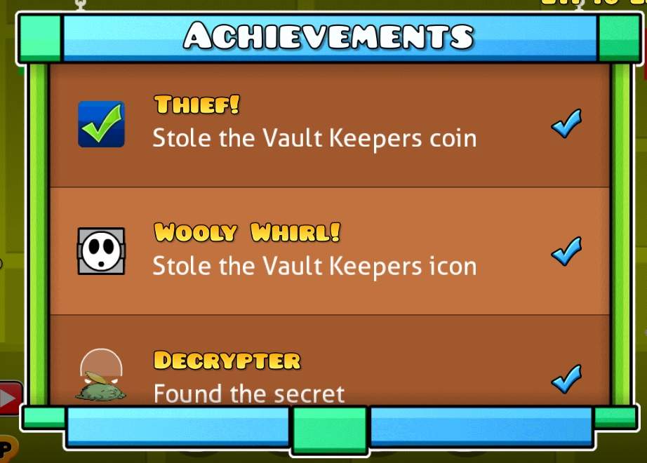
This is my favorite icon, and will remain that way for a very, very, long time.
Worst 1: Um this cube thing
I'm crying right now because of how bad this icon is. It is just the other beginning icon, but the eyes are closer and the mouth is up more… Why, why, why WHY
Thank god you don't have to get 15000 stars for this icon atleast, Hopefully, Robtop, if you are reading this, don't do that.
And that's my list of my favorite and least favorite icons. I might do one with ships and all other vehicles, but I need to know if you guys liked this post to see if I should do more of that agenda, bye!

Представляем вашему вниманию Galactic Texture Pack, сделанный разработчиком и блогером Soluble вместе с новыми значками от GhostPower13.
Основной цвет: темно-зеленый.
Вторичный: зеленоватый и небесный.
Имеет следующие функции:
- Новое цветное меню;
- Все измененные макеты;
- Второе улучшенное меню;
- Новые иконки от GhostPower13;
- Полностью изменен.
В целом это хорошо продуманный текстурный пакет Galactic Tech с новыми дизайнами и профессиональными кнопками.
Читайте также: